.jpeg)
Mcoins: Building a relatable rewards language
A completely new experience
Moneyview's platform had one incentive mechanism: referrals. No rewards program, no internal currency, no systematic way to celebrate user behaviour across their growing product suite — lending, banking, digital gold, UPI.
The business case was clear: reward users for exploring multiple products and create a flywheel that keeps users returning.
The differentiator
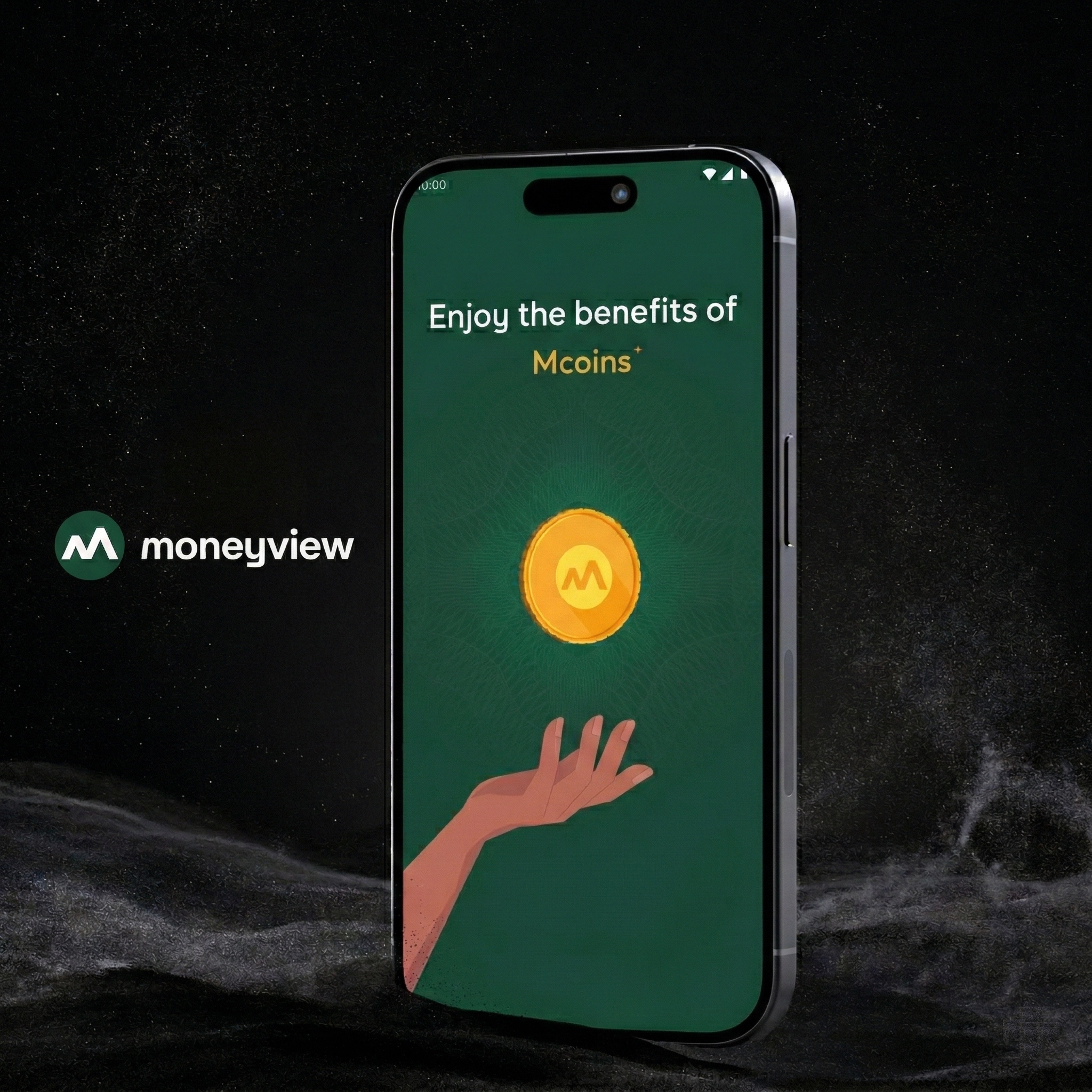
Unlike most reward programs, Mcoins could be converted to real cash and gold— withdrawn directly to a bank account or converted to gold jewellery. This wasn't just points. It was money and a precious asset. The content had to make that feel real, and trustworthy, and exciting.
The mandate
Content-first. The story, strategy, and language had to exist before screens were designed. UX, IA, and visuals were built around the content — not the other way around.
Fintech rewards speak to wallets. We needed to speak to people.
A competitor analysis revealed a consistent pattern across the rewards landscape: functional language built for conversion, not connection. The industry transactional and mechanical.

Content-first meant the story came before the screens
This wasn't the typical UX writing workflow — receive wireframes, write copy, hand back. The content strategy was the foundation everything else was built on. The process ran in this order:
- Competitor study: Audited rewards language across CRED, Flipkart, Google Pay, Paytm, Navi, PhonePe. Identified the emotional gap: functional competence, zero delight.
- User empathy mapping: Mapped five distinct user states — first-timer, waiting for rewards, has enough to redeem, doesn't have enough, has used up all rewards. Each state got its own emotional profile, tone of voice, and storyline.
- Naming the currency: Developed and evaluated six name candidates for the internal currency, with strategic rationale for each. Recommended Mcoins — brand-anchored with a cash connotation.
- Content strategy & copy system: Built a full copy bank: banner headlines, CTAs, earn nudges, redeem states, empty states, low-balance recovery messages. Each with tone guidance and intent rationale.
- UT methodology design: Designed the usability testing framework — objectives, cohorts, tasks, and eight distinct metrics including content comprehension score and information retention rate.
- Post-launch analysis & recommendations: Tracked earn and redemption data post-launch.
Four emotional states. Four distinct voices.
A rewards product isn't a single experience — it's a sequence of emotional moments. A first-timer needs curiosity and trust. Someone with enough coins to redeem needs excitement and permission. Someone short of the threshold needs encouragement, not shame. I mapped each state separately and gave it a different content direction.


Naming the currency
The internal currency needed a name that felt cashlike, brand-owned, and emotionally light. I evaluated six candidates before recommending Mcoins.

The copy system in action
Every piece of copy was written with explicit intent — not just tone guidance but a specific emotional job it needed to do. Here's a selection from the earn and redeem states:

The copy landed in the product exactly as written
The video below show the shipped product. The copy you see — headers, labels, CTAs, state messaging — maps directly to the content strategy.
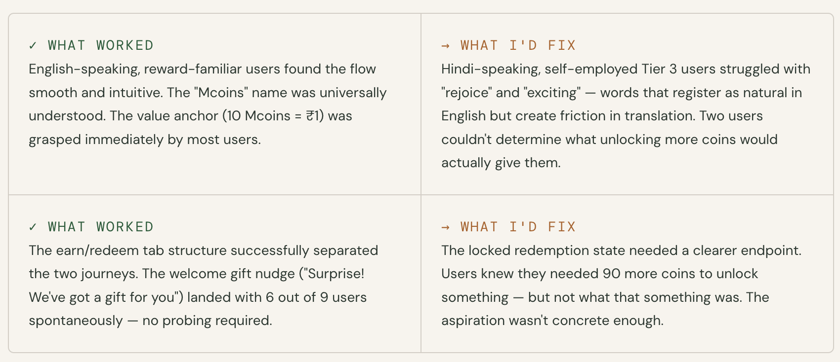
Usability testing: what held, what didn't
I designed and ran a 15-person usability test- three cohorts and two tasks. The test was semi-moderated with participants segmented by product history and reward familiarity.

100K+ users earned. The earn engine worked at scale.

What I learned

Check other
Projects


A framework and methodology to drive conversions at Jar by creating research-driven designs

Understanding the history and political factors which shaped one of the world's most popular music platforms